
In my previous post I showed a fully interactive online graph of one of the plots in my recent paper on leadership in sticklebacks. In this follow-up post I will explain how to easily create such an interactive plot yourself. To be able to do this you will need some experience with the R-language and ideally with ggplot2.
First create an account at plot.ly, which is free. After you have created your account, go to “settings” and click on “generate API key”. You will need your username and this key to link your account to R.
Now you have your account ready start-up R and set-up the R workspace:
# Install the necessary packages
install.packages("ggplot2")
install.packages("gdata")
install.packages("devtools")
install_github("ropensci/plotly")

# Now load the packages
library(ggplot2)
library(gdata)
library("devtools")
library(plotly)

# Set your Plotly user credentials
set_credentials_file("your-username", "your-credentials")
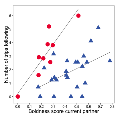
Now just create the ggplot as you would normally. I am recreating the plot exactly as it was published in my recent paper:
# Read the datafile
data = read.xls("dataset.xls")

# Create the ggplot2
plot1 = ggplot(data=data, aes(x=boldness.partner, y=trips.follow)) +

  #Fit a trace to the data
  stat_smooth(method=lm, se=FALSE, aes(fill = bold.cat), colour = "#666") +

  #Plot the datapoints and style them
  geom_point(aes(colour=bold.cat, shape=bold.cat, size=bold.cat)) +
  scale_colour_manual(values = c("#ee1e3a","#4069b2")) +
  scale_shape_manual(values = c(16,17)) +
  scale_size_manual(values = c(7,6)) +

  #Set axes range and titles
  scale_x_continuous(breaks=seq(0, 0.8, 0.1)) +
  scale_y_continuous(breaks=seq(0, 40, 1)) +
  coord_cartesian(ylim=c(-0.5,6.75)) +
  xlab("Boldness score current partner") +
  ylab("Number of trips following") +

  # Style the plot
  theme_bw() + theme(panel.grid.minor=element_blank(), panel.grid.major=element_blank(), text=element_text(size=15), title=element_text(size=18), legend.position="none")
The plot in R now looks like this:
 Now you have created the plot in R it is very easy to make the plot interactive and online:
#Instantiate a Plotly object
pl = plotly()

#Call the ggplotly() method to convert the ggplot2 plot into a Plotly plot
pl$ggplotly(plot1)
A browser window will now open-up showing your newly created plot! To make the plot work best online, I suggest spending some final 5 to 10 minutes to further adapt the plot. This is very easy to do with plot.ly.
For this particular plot I removed the zero-lines and the gridlines, styled the margins and axes, added a plot title and added trend lines for both bold and shy focal fish using the “Fit data” option:
 Finally, instead of the traditional legend I added dynamic plot labels that show which points refer to the bold and shy subset using the “Notes” option:

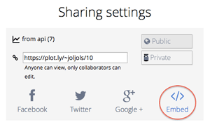
Now you are finished with creating your online plot, the final thing that is left to do is to embed it! To do this, simply click the blue “Share” button in the top right and click on “Embed” on the following screen:
And the final result! Hover over the plot and use your mouse to move the plot around, zoom-in and out etc:
Here is the full R-code to create this specific plot
install.packages("ggplot2")
install.packages("gdata")
install.packages("devtools")
install_github("ropensci/plotly")
library(ggplot2)
library(gdata)
library("devtools")
library(plotly)
set_credentials_file("your-username", "your-credentials")
data = read.xls("dataset.xls")
plot1 = ggplot(data=data, aes(x=boldness.partner, y=sqrt(trips.follow))) +  stat_smooth(method=lm, se=FALSE, aes(fill = bold.cat), colour = "#666") +
  geom_point(aes(colour=bold.cat, shape=bold.cat, size=bold.cat)) +
  scale_colour_manual(values = c("#ee1e3a","#4069b2")) +
  scale_shape_manual(values = c(16,17)) +
  scale_size_manual(values = c(7,6)) +
  scale_x_continuous(breaks=seq(0, 0.8, 0.1)) +
  scale_y_continuous(breaks=seq(0, 40, 1)) +
  coord_cartesian(ylim=c(-0.5,6.75)) +
  xlab("Boldness score current partner") +
  ylab("Number of trips following") +
  theme_bw() + theme(panel.grid.minor=element_blank(), panel.grid.major=element_blank(), text=element_text(size=15), title=element_text(size=18), legend.position="none")
pl = plotly()
pl$ggplotly(plot1)
I hope this post was helpful to researchers wanting to make their science more interactive and for anyone who’d just like to show beautiful interactive online plots. Let me know in the comments below what you think or if you need help!
Leave a Reply