I thought it would be nice to have my Google Scholar profile integrated in my academic website. After some thought and trial and error, I came up with an automated method using R and dropbox to have an up-to-date graph of my citations in the sidebar and on my publications page every day! I gave it a simple look just like you can see on Google Scholar profile pages. If others are interested I may write a blog post some day to help explain how to create one yourself!
My research is currently centred around understanding the role of consistent behavioural differences in the collective movements and functioning of animal groups. In particular, I assay large numbers of stickleback fish on various personality traits and expose them in groups to different ecological scenario’s. I have written custom tracking software in Python using the OpenCV library to be able to accurately track the position of individual fish in the freely-moving schools.
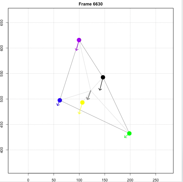
Today I wanted to share a simple visual that highlights the detailed individual-based tracking of a small fish school over time. Each fish is represented by a different colour, with the arrow showing its vectorized movement, with larger arrows indicating a higher speed. The video is centred around the vector of the group as a whole to better visualize the structure of the group over time. Lines indicate the smallest polygon encompassing all individuals and Individual Centre Distances. The moving axes indicate the relative speed of the group in a large circular arena.
In this short section of a 30-min long experimental trial it is clear that the group speed, cohesion, and structure fluctuate over time. At the same time, individuals also maintain to some extent their positions relative to the group centre, such as the green and yellow individual clearly having a stronger pulling power on the movements of the group as a whole.
I used RaspberryPi computers to film the fish, custom Python tracking scripts to acquire individual X,Y coordinates for each individual in the group, R to process the tracking data and acquire movement characteristics, and R with ffmpeg to create the visual.
In my previous post I showed a fully interactive online graph of one of the plots in my recent paper on leadership in sticklebacks. In this follow-up post I will explain how to easily create such an interactive plot yourself. To be able to do this you will need some experience with the R-language and ideally with ggplot2.
First create an account at plot.ly, which is free. After you have created your account, go to “settings” and click on “generate API key”. You will need your username and this key to link your account to R.
Now you have your account ready start-up R and set-up the R workspace:
# Install the necessary packages
install.packages("ggplot2")
install.packages("gdata")
install.packages("devtools")
install_github("ropensci/plotly")

# Now load the packages
library(ggplot2)
library(gdata)
library("devtools")
library(plotly)

# Set your Plotly user credentials
set_credentials_file("your-username", "your-credentials")